A continuation of research in github.com/asarantsev repository Annual-Bank-of-America-Rated-Bond-Data from my previous post. Consider total returns 


If these were Treasury bonds and there were no risk of default, and if these were zero-coupon bonds (with only principal payment at maturity) then total returns would be equal to the rate minus maturity times rate change. See my manuscript arXiv:2411.03699. The equation is: 

The maturity is given in the following table, together with analysis of residuals: skewness, kurtosis, Shapiro-Wilk and Jarque-Bera normality test 
| Rating |  | Skewness | Kurtosis | Shapiro-Wilk | Jarque-Bera | ACF of  | ACF of  |
| AAA | 6.03 | -2.049 | 5.173 | 0.014% | <0.001% | 0.539 | 0.687 |
| AA | 4.89 | -0.941 | 1.154 | 2.549% | 5.831% | 0.944 | 0.874 |
| A | 4.94 | -0.894 | 1.307 | 7.877% | 5.726% | 0.977 | 0.704 |
| BBB | 5.17 | -0.573 | 0.027 | 25% | 46% | 0.38 | 0.604 |
| BB | 3.81 | -1.75 | 3.64 | 0.054% | <0.001% | 0.83 | 0.245 |
| B | 3.12 | -2.036 | 4.323 | 0.003% | <0.001% | 1.17 | 0.653 |
| CCC | 2.55 | -2.304 | 5.34 | 0.001% | <0.001% | 0.9 | 0.716 |
The autocorrelation function plots for
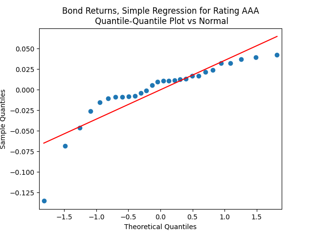
This is confirmed by the results of Shapiro-Wilk and Jarque-Bera tests, shown in the table above.
Apply the same technique as in the previous post: Normalize residuals by dividing them by annual average VIX. We get: 


Coefficient estimates and analysis of innovations 
| Rating |  | |  | Skewness | Kurtosis | Shapiro-Wilk | Jarque-Bera | ACF of | ACF of |
| AAA | 0.0661 | 7.0787 | -0.0034 | -0.737 | 0.576 | 28% | 23% | 0.922 | 0.361 |
| AA | 0.0453 | 5.3226 | -0.0023 | 0.126 | -0.039 | 46% | 96% | 0.57 | 0.761 |
| A | 0.0423 | 5.3423 | -0.0022 | -0.181 | 0.02 | 35% | 93% | 0.73 | 0.459 |
| BBB | 0.0293 | 5.6074 | -0.0016 | -0.232 | -0.775 | 67% | 62% | 0.875 | 0.498 |
| BB | 0.0422 | 3.6671 | -0.0024 | -0.894 | 1.426 | 19% | 6.3% | 0.574 | 0.888 |
| B | 0.0682 | 2.9970 | -0.0050 | -1.562 | 3.479 | 0.397% | <0.001% | 0.998 | 0.354 |
| CCC | 0.0712 | 2.6532 | -0.0075 | -1.588 | 2.649 | 0.072% | 0.005% | 0.835 | 0.723 |
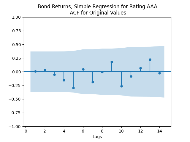
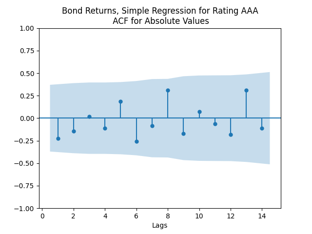
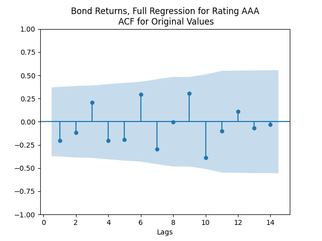
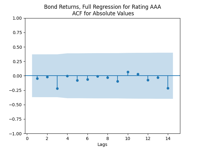
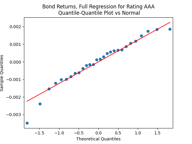
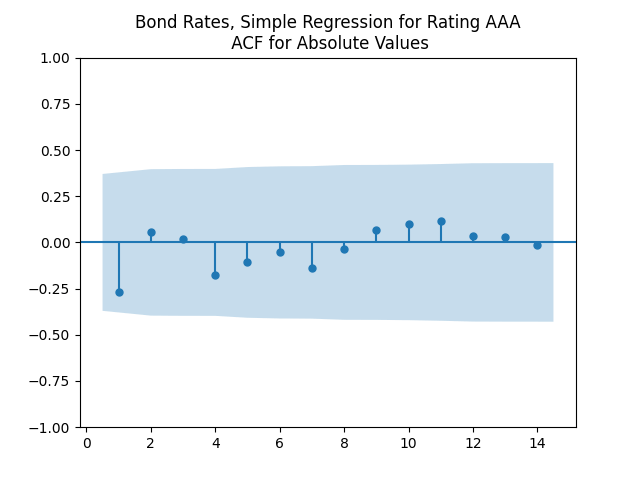
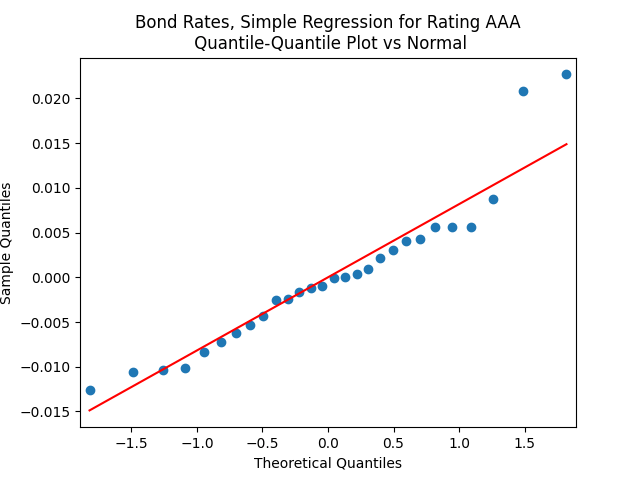
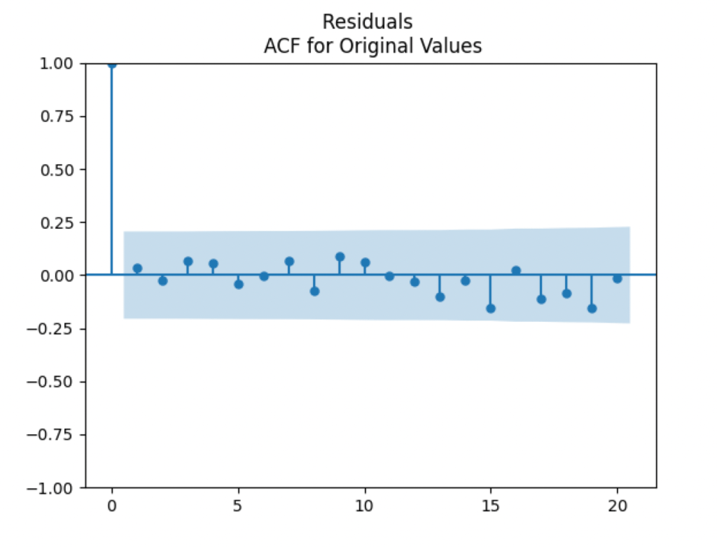
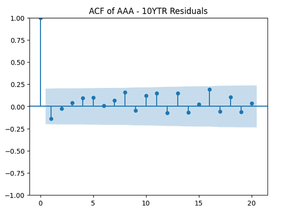
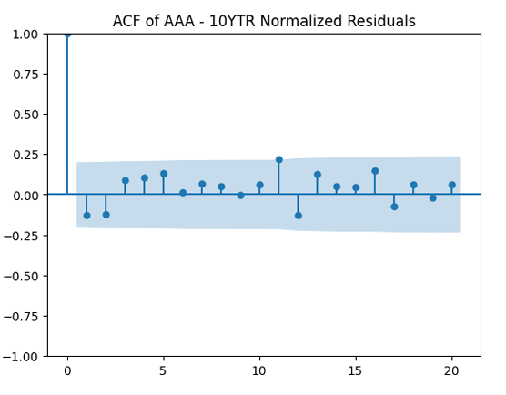
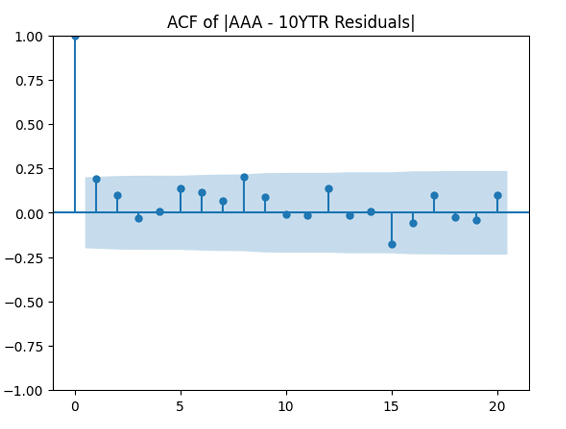
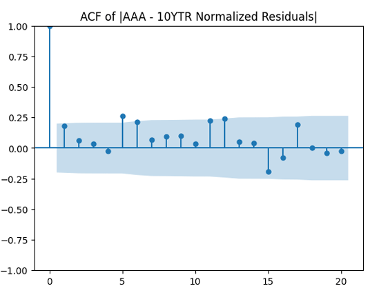
We see the residuals can be well described as Gaussian white noise for ratings BB and higher, especially well for investment-grade bonds. But for B and CCC ratings, not so much. However, judging by the ACF, new residuals (see the second table) are comparable to old residuals (see the first table) in being close to independent identically distributed. See also the following plots for AAA rated bonds:
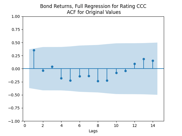
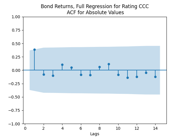
And for the lowest-rated CCC bonds the situation is different: We see that the first lag is quite significant for both version of the autocorrelation function.
Combining the model above with the results of the previous post, we get the trivariate model:


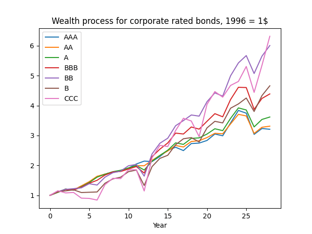
And the wealth process is given by 


Next, for ratings BB and above, the trivariate innovations sequence 
 be this rate at end of year
  Model as an autoregression:


 shows that this is well explained by independent identically distributed random variables (white noise). But these are not necessarily normal, judging by the Shapiro-Wilk and Jarque-Bera normality tests. Especially for junk-rated bonds (BB, B, CCC) but also sometimes for investment-grade bonds. The random walk hypothesis could be rejected (using low
  ). See also the plots below. We present only the plots for AAA, other ratings are similar. One can generate these graphs by running the code from the GitHub repository mentioned above.
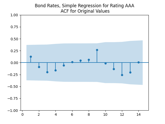

 and
and  Next,
Next,  and
and  for Student
  test for
  The standard deviation for
  is
is  The normality tests for innovations
  for Shapiro-Wilk and
  for Jarque-Bera. The plots for ACF of
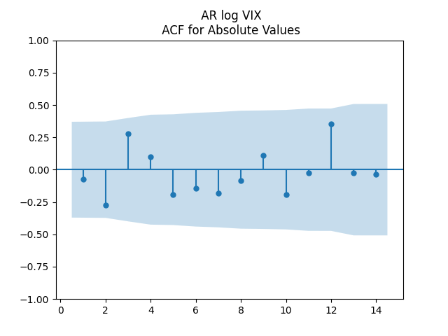
  show independent identically distributed. See below. Thus the log volatility is indeed modeled by the autoregression of order 1, statistically significantly mean-reverting, with Gaussian innovations. This is similar to Angel Piotrowski’s research.
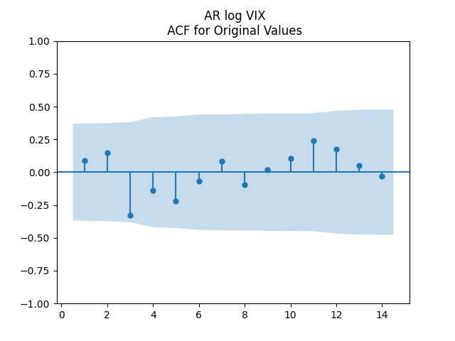
 We have then
 without intercepts. Let us add intercepts:


 for
for  Next,
Next,  for linear regression with
  for most ratings is much higher than without it. So we need to include this term.
  and
and  we get:
![(W(t), \varepsilon(t)) \sim \mathcal N_2([0, 0], \Sigma)](https://s0.wp.com/latex.php?latex=+%28W%28t%29%2C+%5Cvarepsilon%28t%29%29+%5Csim+%5Cmathcal+N_2%28%5B0%2C+0%5D%2C+%5CSigma%29+&bg=ffffff&fg=000&s=0&c=20201002) IID
IID to be the diagonal matrix, but might as well make it a complete matrix. This model fits very well. A disadvantage is that we have only ~30 years of data. We do need to normalize innovations of rates by dividing these by VIX. We do need the term
 of earnings for the last 5 years. This is similar to the classic
  at end of year
 must be 4-5%. This equation shows that after detrending, this is the classic autoregression of order 1. We can rewrite this in the more standard ordinary least squares regression form:

 and
and  and
and  All three coefficients are significantly different from zero: Student T-test gives
  values
  But the Jarque-Bera test shows that innovations are not Gaussian:
  This is confirmed by the following quantile-quantile plot below. But the autocorrelation function plots for
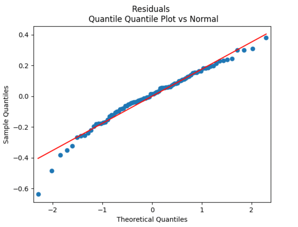
 is ~2% per year, and total market returns
  and it is much higher than 4-5% per year for a few years, then the stock market starts to be overvalued. We formally can write this as an autoregression of order 1 for the cumulative sum
  after subtracting the trend
  where
where  . Our bubble measure is
  and it is high when the market is overvalued. Let us write linear regression:
 We can see that the estimate for
  gives
gives  so we can reject the random walk hypothesis: The model is stationary after detrending. Moreover, we can apply the Student test, since the residuals (innovations)
  with
with  This is shown by the autocorrelation function plot for


 Angel did this by making the autocorrelation function plots for
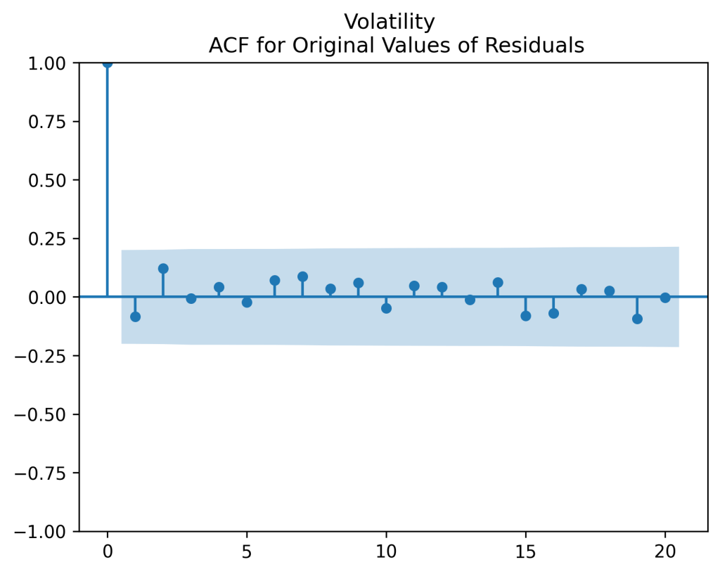
 and
and  so there is mean-reversion. She did not test for unit root but I am very sure this hypothesis (that
  ) would be rejected.
  is Gaussian with mean -4.68 and variance 0.218. Using the moment generating function for the normal distribution, we can compute
 ![\mathbb E[V(\infty)] = 0.0104](https://s0.wp.com/latex.php?latex=+%5Cmathbb+E%5BV%28%5Cinfty%29%5D+%3D+0.0104+&bg=ffffff&fg=000&s=0&c=20201002) and variance
and variance 


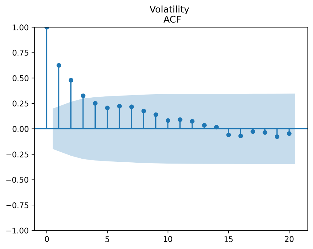
 is shown on the right. It is clear there is significant autocorrelation with lag 1. Both plots seem to be for white noise, no autocorrelation.
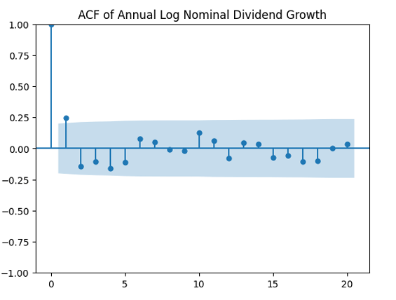
 and December Consumer Price Index
  We take the price
  . Price returns are computed as
  and total returns are
  for nominal versions. But for real versions, we need to subtract
  from each of these. You see that all returns are logarithmic (geometric), so there is no problem of compound interest. If wealth at end of year
  then
then  where
where 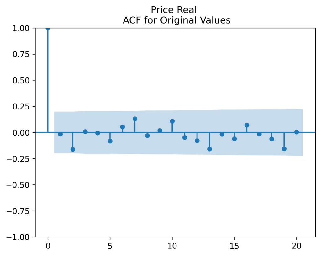
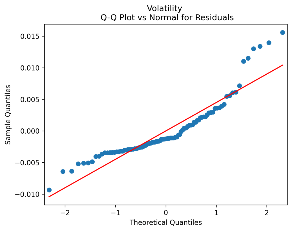
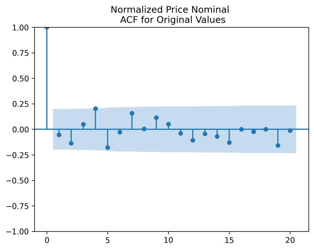
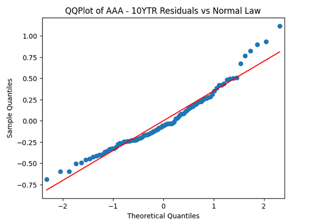
 (right panel) show these are close to zero. So it is reasonable to model these as independent identically distributed random variables. However, the below quantile-quantile plot versus the normal distribution shows these are not normal.
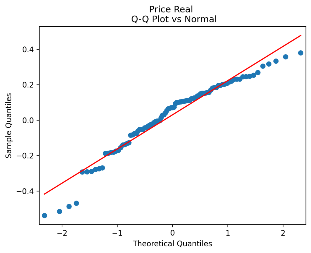

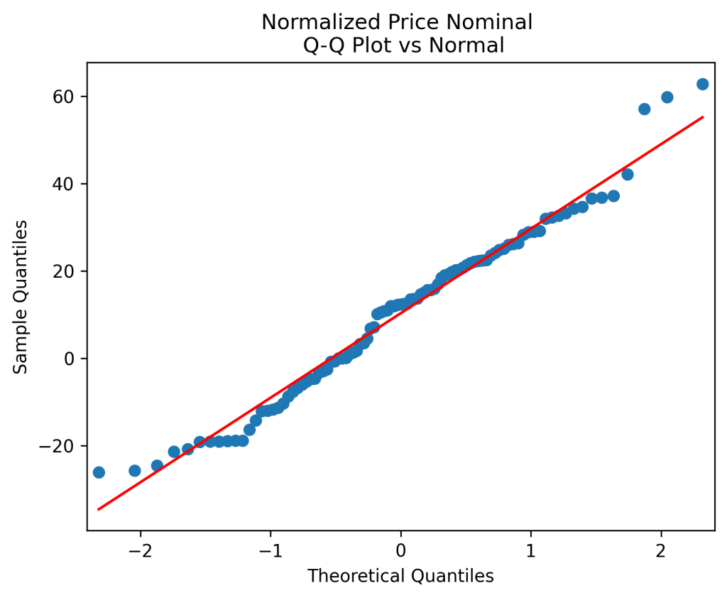
 We do this first for nominal earnings, without adjustment for inflation. We analyze
  whether it is Gaussian independent identically distributed. We make the quantile-quantile (QQ) plot versus the normal distribution.
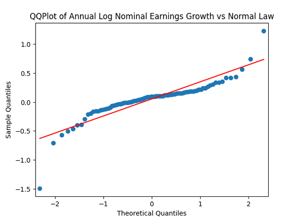

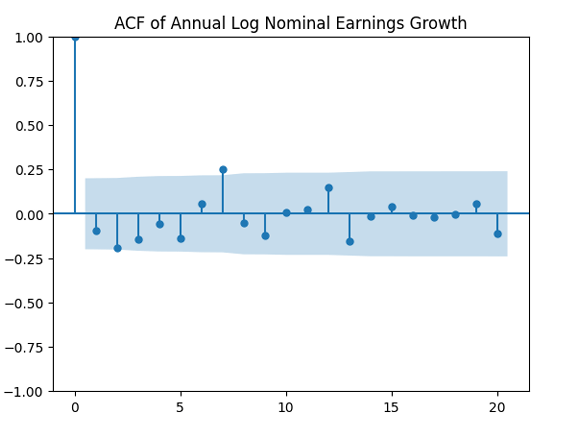
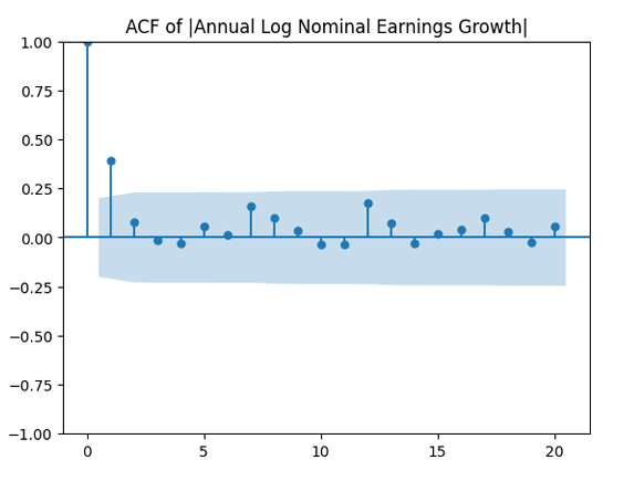
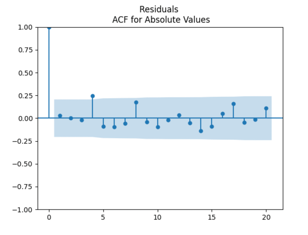
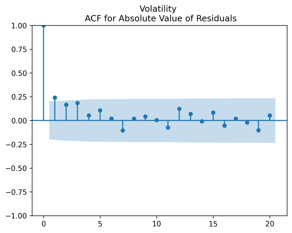
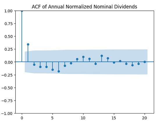
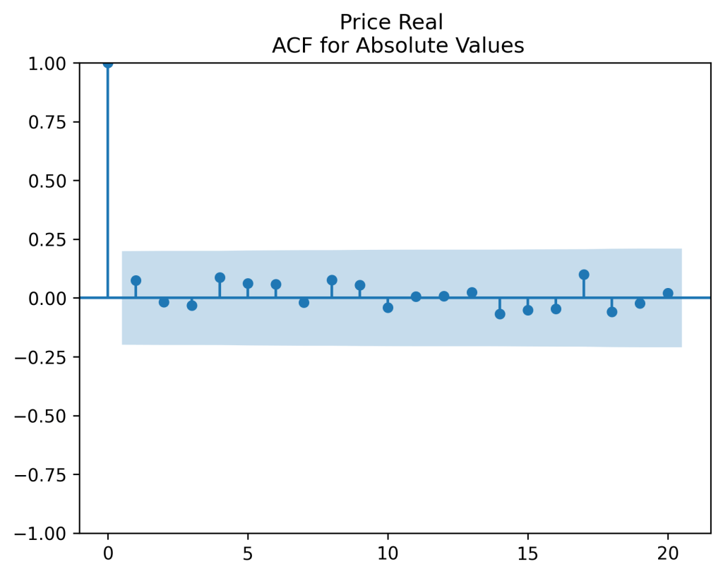
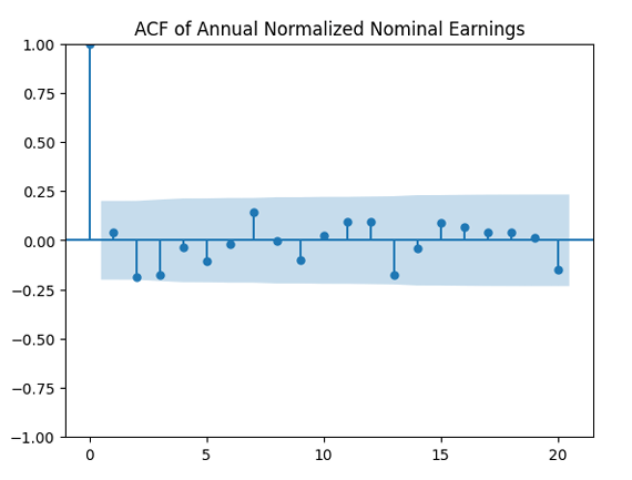
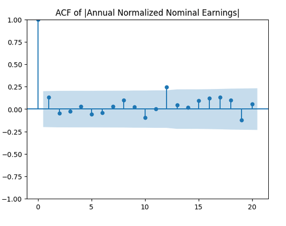
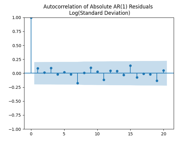
 are uncorrelated. But with absolute values, this is not true. There is a significant autocorrelation of lag 1:
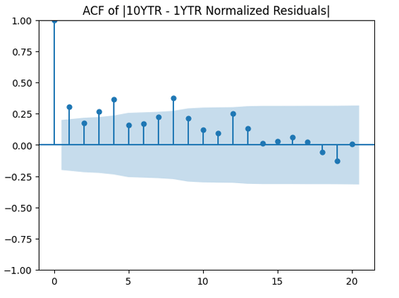
 Does this division improve these terms to make them closer to Gaussian independent identically distributed? In fact, yes!
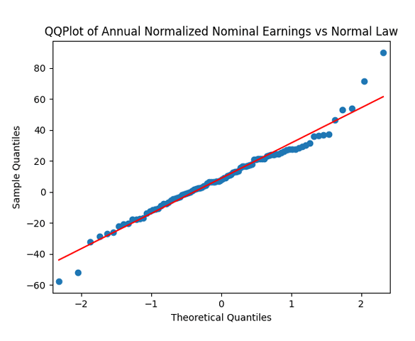
 as independent identically distributed Gaussian.
![(W(t), Z(t)) \sim \mathcal N_2([0, 0], \Sigma)](https://s0.wp.com/latex.php?latex=+%28W%28t%29%2C+Z%28t%29%29+%5Csim+%5Cmathcal+N_2%28%5B0%2C+0%5D%2C+%5CSigma%29+&bg=ffffff&fg=000&s=0&c=20201002) are independent identically distributed bivariate normal, with mean zero and covariance 2×2 matrix
are independent identically distributed bivariate normal, with mean zero and covariance 2×2 matrix  Apply an autoregression of order 1:
  We expect mean reversion for this spread, which is true for
  This is different from
  where this process is a random walk, when future movements are independent of the past.
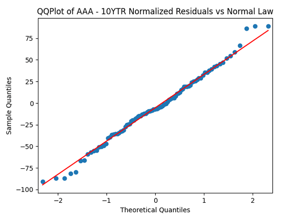
  Apply the quantile-quantile plot versus the normal distribution. Next, divide these innovations by annual volatility and make the quantile-quantile plot again.
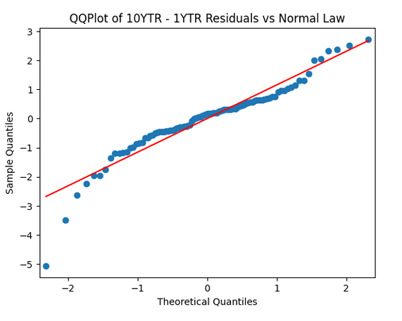
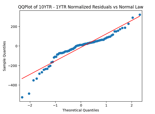
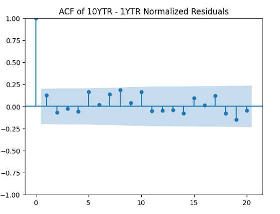
 Next, divide by the volatility and plot the autocorrelation function again, now for
  Both plots seem to be for white noise, no autocorrelation.
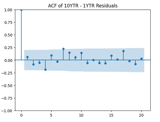
 to see whether it improves the result. It does not, in fact!
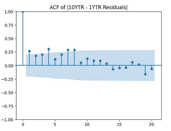
 Then she computed standard deviation of these log returns for day
  be this standard deviation, usually called volatility, for year
 It is defined as
  This looks like an autocorrelation function for an autoregression of order 1.
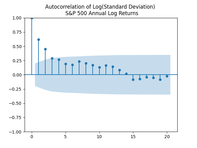
 with
with  and
and  Let us test whether the innovations
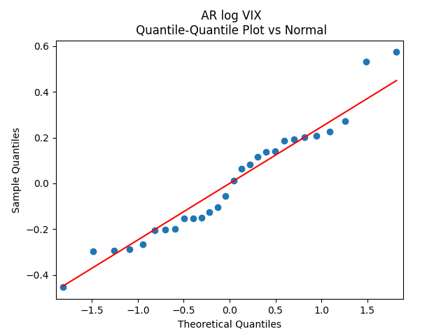
  are Gaussian. Apply the quantile-quantile plot versus the normal distribution. This looks like pretty close to a Gaussian law!
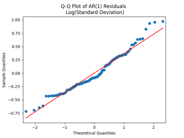
 to see that they correspond to white noise.
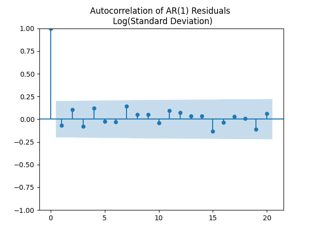
 We have numerical estimates
  Therefore, this autoregression has a stationary distribution, or an invariant probability measure,
  such that
  Angel has computed that mean and variance of this stationary distribution.